- 1 What Is a Mobile-Friendly Responsive Website?
- 2 Is WordPress Mobile Friendly by Default?
-
3
9 Expert Tips on How to Make Your WordPress Site Mobile Friendly
- 3.1 1. Use a Truly Mobile-Responsive WordPress Theme
- 3.2 2. Optimize Font Size and Line Spacing for Mobile Readers
- 3.3 3. Simplify Your Mobile Navigation
- 3.4 4. Optimize Images for Mobile Devices
- 3.5 5. Speed Up Your Mobile Website on WordPress
- 3.6 6. Avoid Intrusive Popups on Mobile
- 3.7 7. Make Buttons and Forms Touch-Friendly
- 3.8 8. Test Your WordPress Site on Real Mobile Devices
- 3.9 9. Remove Unnecessary Content for Mobile Users
- 4 Make Your WordPress Site Mobile-Ready
If you’re wondering “Is WordPress mobile friendly?”, the short answer is: it can be, but only if it’s set up correctly.
While WordPress supports responsive design, many sites still fail to deliver a smooth mobile experience due to poor themes, slow loading times or cluttered layouts.
Here’s a fact: More than 60% of global web traffic comes from smartphones, not desktops. And if your site doesn’t adapt to smaller screens, users will simply leave.
The good news is that making a WordPress site mobile friendly is easier than ever. All you need is some Pro WordPress tips and tricks.
In this guide, we’ll show you simple, expert backed steps to create a responsive WordPress site that looks great and performs well on all screen sizes.
So let’s dive in!
What Is a Mobile-Friendly Responsive Website?
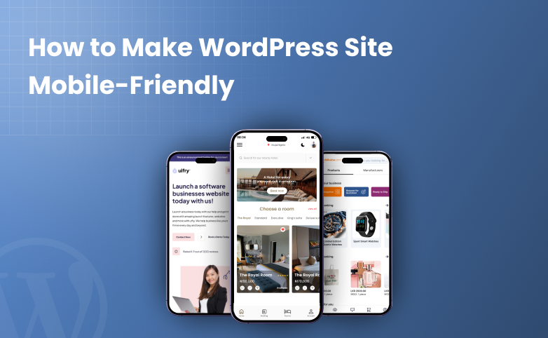
A mobile-friendly responsive website means your site can automatically adjust its layout, content, images and features to fit different screen sizes, especially smartphones and tablets.
Making your site easy to read, navigate and use on any device is also helpful for readers and users.
In simple words, mobile optimization delivers the same content to all users but displays it differently based on the device screen size.
Further, even from an SEO perspective, responsive design is also important. Google recommends responsive WordPress sites and uses mobile-first indexing. This means the mobile version of your site is considered the primary version for ranking.
That’s why making a mobile-friendly responsive website for WordPress improves both user experience and search visibility.
Is WordPress Mobile Friendly by Default?
The answer is simple: Yes! WordPress is mobile friendly by default but only at a basic level.
The WordPress core supports responsive design which means it can adapt to mobile devices if your theme and plugins are optimized for mobile use.
However, in reality, WordPress itself doesn’t control how your site looks on smartphones, your theme does.
If you use a modern, mobile responsive WordPress theme, your site will automatically adjust to different screen sizes. On the other side, outdated themes, poorly coded plugins or heavy custom layouts can easily break mobile view.
Here’s what WordPress handles by default:
- Supports responsive themes
- Uses mobile-compatible HTML and CSS
- Works well with mobile first indexing when properly optimized
But WordPress does not automatically:
- Optimize images for mobile devices
- Improve mobile loading speed
- Fix poor navigation or touch issues
- Remove intrusive popups on mobile
- Ensure plugins behave well on small screens
In simple words, WordPress can be mobile friendly, but achieving a truly mobile friendly responsive site needs choosing the right theme, plugins, and a lot of tips and tricks which we’ll show you now.
9 Expert Tips on How to Make Your WordPress Site Mobile Friendly
1. Use a Truly Mobile-Responsive WordPress Theme
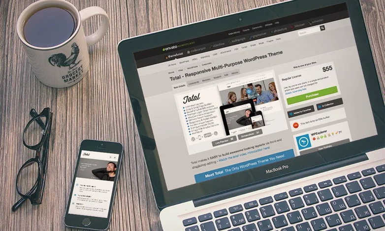
Speaking from experience, the first and most important step to make your WordPress site mobile friendly is choosing a mobile responsive theme.
Having a responsive WordPress theme can automatically adjust your site’s layout, fonts, images and navigation to look great on any device, whether it be smartphones, tablets or desktops.
The best part is many of the most popular and best WordPress themes are already mobile friendly. The best responsive WordPress themes are:
- Astra
- Neve
- OceanWP
- and the list goes on.
A mobile ready WordPress theme can boost user experience and is favored by Google for mobile-first indexing. A win-win situation for both.
Plus, they save time because you don’t need to create separate mobile versions of your site.
Pro Tip: Even with a responsive WordPress theme, you should test your site on real mobile devices to make sure everything, from menus to forms, works smoothly.
2. Optimize Font Size and Line Spacing for Mobile Readers
Even with a responsive theme, your text can be hard to read on small screens if the font size and line spacing aren’t optimized.
Mobile readers need larger clear text and enough spacing to scroll comfortably without zooming in.
Remember it won’t take even a single second for text that looks picture-perfect on desktop to turn upside down on mobile.
With proper line height and font size, you can improve readability and keep users engaged.
In our experience, here’s the best way to optimize font size and line spacing for mobile readers:
- Use a minimum font size of 16px for body text.
- Keep all your headings proportionate: H1 should stand out, H2/H3 should be clear but not overwhelming.
- Adjust line height to 1.4–1.6 for easy reading on small screens.
- Use Google Fonts or system fonts optimized for readability on mobile.
At last, test on multiple devices as what looks good on a desktop might be tiny on a phone. Mobile-friendly typography helps your SEO as Google values user experience signals more than anything else.
Pro Tip: Some page builders (like Elementor or Divi) allow device specific font settings. Thus, you fine-tune typography separately for mobile, tablet and desktop.
On smaller screens, cluttered menus or complicated layouts make it hard for users to find what they need. And this can easily lead to frustration and higher bounce rates.
A simple navigation lets your visitors move around your site effortlessly. It means more engagement and direct boost on conversions from mobile devices.
While it sure can sound like limiting your site’s creativity, yet it must be done otherwise the only option left will be hiring an expensive developer.
To make your WordPress navigations mobile-ready, here are some proven ways:
- Use a hamburger menu or collapsible menu to save space
- Limit menu items to 5–7 main links for clarity
- Prioritize important pages like Home, Products, Services and Contact
- Avoid long dropdowns and always opt for single level menus or expandable submenus
- Make clickable areas large enough for easy tapping on mobile screens
Making a clear navigation in your WordPress site encourages longer visits which helps SEO ranking.
Pro Tip: Test your menu on multiple devices and screen sizes. If users struggle to tap links or find pages, consider reordering menu items or creating a simplified mobile-only menu.
4. Optimize Images for Mobile Devices

Images are exactly what makes a website eye-catching (Unless you’ve pro-level animation on your site). However, on mobile devices, large or unoptimized images can slow down your site and hurt user experience.
These days, high quality website images are must-haves for user experience and SEO boosting, yet by optimizing images, we can find a middle ground.
Optimizing website images makes them load faster while still looking sharp on small screens.
To optimize your WordPress site’s images for mobile devices, you can:
- Resize images to the exact dimensions needed instead of uploading huge files
- Use WebP or compressed JPEG/PNG formats to reduce file size (not too much compressed images otherwise you may lose quality)
- Try lazy loading so images load only when users scroll to them
- Use responsive images with the “srcset” attribute so different sizes load depending on device
- Try considering simpler alternatives or CSS animation effects if you’re a tech-savvy guy.
In the end, optimized images make your site faster and more mobile friendly as well as enhance the overall user experience to keep your visitors engaged on all devices.
Pro Tip: WordPress image optimization plugins such as Smush, ShortPixel or Imagify can automatically compress and optimize images for mobile.
5. Speed Up Your Mobile Website on WordPress
There’s no meaning of making your WordPress site responsive when it loads like a snail.
Slow WordPress sites frustrate visitors, increase bounce rates and negatively impact your search rankings.
That’s why optimizing your WordPress site for speed is essential and also makes sure you give your mobile users a complete smooth mobile experience and better engagement.
Now, for achieving fast loading in your WordPress site, you can use the fastest WordPress themes which are already lightweight and popular for its speed.
If you need recommendations, then check out our picks of the best fastest WordPress themes in 2026.
Aside from this, you can also follow these proven ways to speed up your WordPress site on mobile as well:
- Install a caching plugin like W3 Total Cache or WP Rocket to reduce load times.
- Minify CSS, JavaScript and HTML to remove unnecessary code
- Enable lazy loading for images and videos.
- Use a Content Delivery Network (CDN) to serve content faster to mobile users worldwide.
- Optimize your database by removing unused plugins, drafts, and spam comments.
A faster WordPress mobile site not only improves user experience but also boosts your SEO ranking. Thus, your WordPress site ranks higher and your visitors stay engaged.
Pro Tip: Test your site speed on mobile using tools like Google PageSpeed Insights or GTmetrix and follow their mobile optimization suggestions.
6. Avoid Intrusive Popups on Mobile
Popups on any site works the best for boosting conversion, lead generation and engagement. Yet on the flip side, popups may work on desktop, but on mobile devices they often do more harm than good.
Intrusive popups can block content, frustrate users and even lead to penalties in search rankings if they mess up with the user experience.
But why? The answer is simple: Mobile screens are mostly smaller compared to PC and Laptop screens so full screen popups can make content unreadable. Also, sometimes it is difficult to close as well which leads to users leaving the site completely.
Plus, Google discourages intrusive interstitials that negatively impact mobile usability. Annoying popups also increase bounce rates and reduce engagement so we suggest you to:
- Avoid full screen popups that appear right after page load.
- Use smaller banners, slide-ins or inline forms instead of blocking overlays.
- Delay popups until users have spent some time on the page.
- Make sure popups are easy to close with clearly visible close buttons.
- Disable non essential popups completely on mobile devices.
Thus, you can create a smooth and more user friendly mobile experience to keep your visitors engaged while also complying with Google’s mobile-friendly guidelines.
Pro Tip: Many popup and form plugins such as ARForms allow you to create fully responsive forms and popups so you can show popups on desktop while keeping the mobile experience distraction-free.
7. Make Buttons and Forms Touch-Friendly

On smart phones, users interact with your site using their fingers, not mouse.
That’s why, Small buttons, tight spacing or tiny form fields can lead to frustration, misclicks and abandoned actions. And the best way to solve this problem is by making your buttons and forms touch friendly. Having touch friendly buttons and forms improves your chances of conversion.
So all you gotta do to make your buttons and online forms mobile-ready is:
- Add enough spacing between buttons and links.
- Use mobile optimized form fields with proper labels and placeholder text.
- Make buttons large enough (at least 44×44 pixels) and easy to tap.
- Enable autofill and mobile keyboards (email, phone, number) for easier input.
- Avoid overly long forms and try to break them into steps if possible.
Making touch-friendly design makes sure your visitors can interact seamlessly with your WordPress site. In the end, it leads to higher engagement and better mobile experiences.
Pro Tip: Test all forms and buttons on real mobile devices.
8. Test Your WordPress Site on Real Mobile Devices
Even if your WordPress site looks picture perfect in a theme demo or on a desktop, real mobile testing is something not to ignore.
Emulators and responsive previews are sure helpful but they can’t fully replicate real world usage, network speeds or device specific behavior.
That’s why, we suggest you to use a number of smart phones and even in them, there’s screen size difference.
Don’t forget to test on both iOS and Android to catch platform specific quirks. At last, check page speed and loading on mobile networks (3G/4G/5G).
If you don’t have that many smart phones to test, you can simply ask your employees, friends or colleagues to navigate your site via their smart phones and offer feedback.
You can also use tools like Google Mobile-Friendly Test or BrowserStack for additional insights.
However, if you have none of that and your website is already live, you can check the mobile responsiveness from your browser as well.
- First go to the Chrome browser and open your WordPress site which is supposed to be live on any URL, either be it testing or real.
- Next, simply right click and you’ll see a popup menu.
- In here, click the “Inspect” and you’ll see a new popup appearing under your site.
- Now look for the toggle device toolbar and hit “Ctrl + Shift + M”.
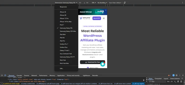
As you can see, you can now select any smart phone model from here and see how your site will work in mobile even from browser.
Pro Tip: Regular testing after updates makes sure your WordPress site remains mobile-friendly as you add new content or plugins.
9. Remove Unnecessary Content for Mobile Users
Mobile screens are limited in size so cluttered content can overwhelm visitors.
Thus, by removing unnecessary content, your visitors can focus their attention on key actions. Also, it simplifies the navigation. So no more endless scrolling just to look for the important actions or content that matters.
Pro Tip: Prioritize calls-to-action such as buttons, forms and key links on mobile to guide users more effortlessly.
Make Your WordPress Site Mobile-Ready
Creating a mobile-friendly WordPress site is a must in 2026. It directly impacts your conversions, SEO ranking and user experience.
So if you are still wondering how to make a WordPress site mobile-friendly? Here’s a quick recap of all the best WordPress tips, backed by experts:
- Use a truly mobile-friendly WordPress theme
- Optimize your font size and line spacing
- Make mobile navigation simple
- Optimize website images for mobile
- Speed up your WordPress site
- Try to avoid Popups on mobile
- Make sure your buttons and online forms are touch friendly and responsive
- Test your WordPress site on real smartphones
- Remove unnecessary content from mobile devices
And that’s it! Now your WordPress site is fully mobile-ready and conversion-ready to go live!
Related Articles