Remember when websites only needed to look good on a desktop, and pinching and zooming was just part of the experience? Those days are over.
Now it’s non-negotiable. WordPress sites that break on phones or tablets don’t just frustrate users, they lose traffic and rankings both.
And you can’t simply turn an blind eye to the fact that over 60% of your visitors now surf the internet on smartphones, and if your theme isn’t responsive, you’re practically asking them to leave.
The good news? You can get back those visitors by having a responsive WordPress theme.
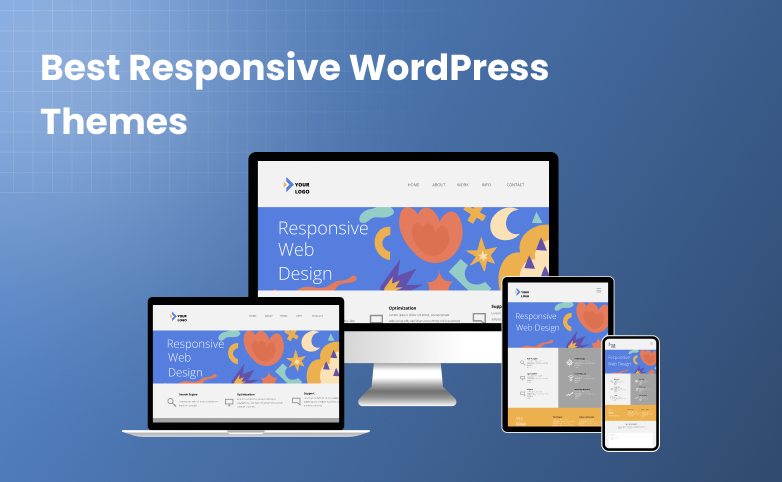
Adding responsive themes in WordPress means being ready to give a perfect experience on any screen. From automatically optimized layouts to smooth navigation, these mobile friendly WordPress themes that turn frustrated clicks into happy visitors.
In this guide, We’ll show you the best responsive WordPress themes in 2026 and beyond. Whether it be a giant monitor or foldable phone, these themes are smart, adaptive and SEO friendly.
So without further ado, let’s dive in!
Quick Overview of Top Responsive WordPress Themes
Short on time? If you say so, take a look at the best responsive WordPress themes and choose your best-fit theme right now.
| Rank | Theme | Best For |
| 🥇 | Astra | Any kind of website: blogs, stores, or business sites. Super customizable. |
| 🥈 | GeneratePress | Clean and lightweight sites. Great for developers and fast loading projects. |
| 🥉 | Neve | Mobile first blogs and business sites that need speed and flexibility. |
| 4 | OceanWP | Complex sites, online stores, and membership sites that need extra features. |
| 5 | Kadence | Agency sites or any site using page builders. Smooth and professional. |
| 6 | Hestia | Startups, portfolios, or one-page business websites. Easy to set up. |
| 7 | Sydney | Freelancers or businesses wanting a bold, responsive design. |
| 8 | Responsive (CyberChimps) | Simple, beginner-friendly websites that just work. |
| 9 | Guten Theme | Perfect for Gutenberg users, blogs, and small business sites. |
How We Choose and Test a WordPress Responsive Theme
Before recommending any responsive WordPress theme, we go through a real, business focused evaluation process. The exact same kind of testing we know site owners actually care about.
Because let’s be honest:
A WordPress theme might claim to be responsive or mobile friendly but the moment you open it on a foldable phone, a tablet or even a slightly older phone….things start breaking.
Menus overlap. Images stretch. Buttons hide.
We’ve seen it all.
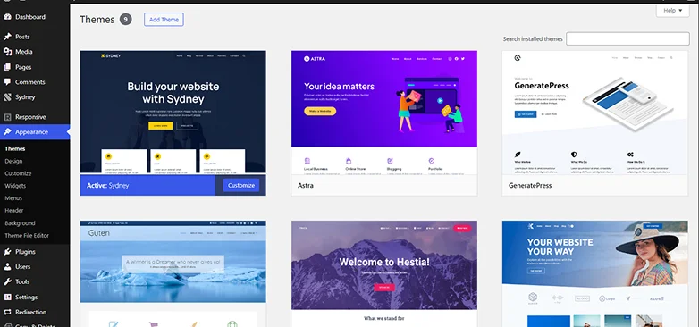
That’s why our selection process is not based on pretty demos like other articles. It’s based on how well a theme performs in real world scenarios.
Here’s what we tested:
- Cross Device Responsiveness: We always checked WordPress themes across a wide range of devices such as large desktops, laptops, tablets, modern and older smartphones and even foldable screens for an actual perfect user experience.
- Core Web Vitals Performance: A theme that takes forever to load or jumps around on scroll? That’s a conversion killer, thus we only picked themes that passed Core Web Vitals.
- Navigation & Touch Friendly UX: We made sure all responsive themes for WordPress we shortlisted are smooth and easy to navigate.
- Page Builder & Plugin Compatibility: A WordPress theme that claims to be the “BEST” should never break when you install WordPress plugins like WooCommerce, Elementor or more.
- Image & Media Optimization: Responsive isn’t complete without optimized visuals. So we checked whether the theme can serve the right image size for the right device, use modern formats like WebP and keep galleries, sliders, and embeds clean on mobile.
- Real Content Stress Test: Demo content always looks perfect but maybe your real content won’t. That’s why we load long blog posts, product grids, mixed images, videos and more to test it. Only the passed on made the cut out on our list.
- Customization Without Confusion: We also made sure all the responsive WordPress themes we picked came with easy customization options.
9 Best Responsive WordPress Themes in 2026 & Beyond
Astra

If there’s one theme that consistently nails responsiveness year after year, it’s Astra.
With over 1+ million active installations, Astra is one of the most popular and lightweight responsive WordPress themes around here. It comes with a 300+ premium starters client ready templates which you can easily customize as per your brand’s style.
It’s lightweight, fast, and built to look pixel perfect on every screen. Whether someone is browsing from a 6.1” smartphone, a giant 4K monitor or even a foldable device, Astra always gives a perfect website look.
During hands-on testing, we also realized this responsive WordPress theme is built for speed and SEO. The loading time was approx. ~400 ms so your website loads lightning fast and ranks higher.

Besides, the page building in Astra is also super fast with its advanced widgets, layouts and controls.
Why Astra Stands Out as a Responsive WordPress Theme
- Blazing Fast Performance (Under 50KB)
- 100% Responsive Layout System
- Customizable Mobile Header
- Built for page builders
- Optimized for Core Web Vitals
- 300+ Prebuilt Starter Templates (All Fully Responsive)
- Works Seamlessly With WooCommerce
GeneratePress

If Astra is known for flexibility, GeneratePress is the theme known for pure performance.
It’s one of the most lightweight and stable responsive WordPress themes ever built and that shows the moment you load a site with it.
Trusted by 500,000+ website owners, GeneratePress combines rock solid code quality with an ultra clean responsive design system that adapts flawlessly to any screen size. Whether it’s a compact smartphone, tablet, laptop, ultrawide monitor or a foldable screen, GeneratePress maintains its structure without a single alignment issue.
During our testing, we found that GeneratePress delivered some of the fastest loading times among all themes on this list which is often under 300ms on a well optimized setup.
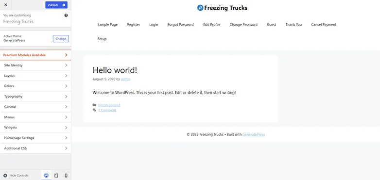
What also stands out is how developer friendly and page builder friendly GeneratePress is. Its dynamic layout controls, minimalist structure, and compatibility with Gutenberg & major builders like Elementor, Beaver Builder, Bricks makes the customization smoother.
Why GeneratePress Stands Out as a Responsive WordPress Theme
- Ultra Lightweight Performance ( 7.5 kb page size)
- Perfectly Responsive on All Devices
- Mobile Optimized Navigation
- Superior Core Web Vitals Scores
- Page Builder Compatible
- Advanced Layout Controls
- WooCommerce Ready
- Local font library
Neve

If you want a WordPress theme that feels modern, fast and unbelievably smooth on every device, Neve is the one that always makes the shortlist.
Designed with a true mobile first approach, Neve is one of the best mobile friendly WordPress themes.
Before adding Neve to this list, we put it through the same kind of real device testing we do with all responsive WordPress themes and….Neve passed every check with flying colors.
It’s lightweight, incredibly flexible, and loads in under a second, which is exactly what your SEO, mobile users, and conversion rates need today.

Neve also offers dozens of responsive starter templates, an easy to use header/footer builder, and smooth compatibility with Elementor, Gutenberg, Beaver Builder, Brizy, and more.
What makes Neve the best responsive theme in WordPress:
- Fast and lightweight (only 28kb file size)
- Easy setup and sleek designs
- Fully customizable and responsive
- Global color palettes
- 110+ ready to go starter sites and templates
- Smoothly integrates with WooCommerce
- White label feature for developers and agencies
OceanWP

OceanWP is one of those themes that handles any device, any layout and any plugin combination without losing performance or breaking your design.
During our testing, OceanWP stood out for one major reason: it handles complex websites as easily as it handles simple ones.
eCommerce stores, membership sites, blogs, portfolios, everything stays responsive, clean, and highly usable across screen sizes.
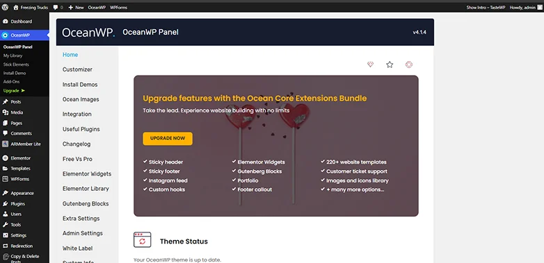
The theme also comes with deep WooCommerce integration, making it ideal for online stores that want mobile optimized product displays, slide in carts and fast checkout flows.
And with over a dozen free extensions, OceanWP can easily grow with your business without slowing your site down too.
Why OceanWP Stands Out as a Responsive WordPress Theme
- Advanced Responsive Controls
- Fully responsive and customizable
- SEO friendly
- Over 240+ templates for Elementor and Gutenberg
- Popup builder
- Extensive styling options
- Out-of-the-box desktop & mobile header styles.
- Smoothly connects and works with popular page builders, WooCommerce, form builders, LMS, and many more.
- Over 100+ WooCommerce templates
Kadence

Among all responsive themes we tested, Kadence delivered one of the smoothest, most polished mobile experiences and that’s actually saying something.
Kadence is already a popular WordPress theme for its clean design system, lightning fast performance and perfectly balanced feature set.
What makes Kadence special is its smart layout engine. Everything from the header to the content blocks adapts elegantly to different screen sizes with zero effort on your part.
No stretched images, no broken grids, no hidden buttons.
Kadence also has one of the best header builders out there, allowing you to create mobile friendly menus, shopping icons, search options, and call to action buttons without touching code.

Moreover, its starter templates are modern, conversion focused and fully optimized for mobile first.
What makes Kadence one of the best responsive WordPress themes:
- Device Specific Customization
- Advanced header and footer builder
- Lightweight
- Global Design Settings
- Comes with integrated responsive blocks for building advanced and complex page layouts
- SEO friendly
Hestia

Hestia is a modern responsive WordPress theme that gives you a premium vibe with no complex setup.
This responsive theme for WordPress is known for its clean Material Design UI, beautiful mobile layout and one page structure that loads super fast on every device.
It’s also fully compatible with page builders like Elementor and Gutenberg. Thus, you can redesign anything with zero coding.

During our tests, Hestia performed amazingly well in Core Web Vitals and mobile responsiveness, making it great for blogs, agencies, small businesses, portfolios and startups.
Why Hestia Stands Out as a Responsive Theme
- Slick designs
- Amazing WooCommerce designs
- Advanced blogs options
- WooCommerce ready
- Otter Blocks Pro
- Product quick view
- Live Customizer and Mega Menus
- Full responsive and retina ready designs and layouts
Sydney

Sydney is a powerful responsive WordPress theme for businesses and freelancers who want a professional website without hiring a developer.
It comes with bold typography, beautiful hero sections, and flexible layout controls so your site looks striking on mobile, tablet and desktop. The built in responsive grid ensures every section auto adjusts perfectly no matter the device width.
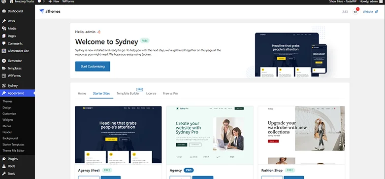
Sydney also offers deep integration with Elementor so you can create stunning pages with simple drag and drop as well. Plus, its performance improvements in the recent versions make it one of the fastest loading business themes in 2026.
Why Sydney Stands Out as a Responsive Theme
- Pixel perfect responsive designs
- Deeper Elementor integration
- Live customizer previews
- Flexible header and footer options
- Pre build sections and starter templates
- Template builder module
- 65+ Premium Elementor Widgets
Responsive by CyberChimps
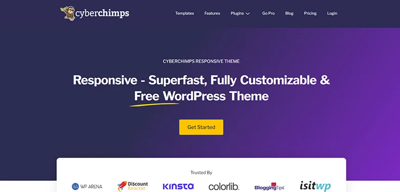
If you want a simple, clean and extremely reliable responsive WordPress theme, Responsive by CyberChimps is one of the best beginner friendly options.
It’s super lightweight, fast and built from the ground up to adapt beautifully on mobile, tablet and desktop.
Best of all, this mobile friendly theme for WordPress comes with over 250+ ready made website templates which are all optimized to load fast and look perfect across devices.

During testing, Responsive scored high in mobile speed, accessibility, and Core Web Vitals, making it one of the most stable free WordPress responsive themes in 2026.
What we love about this responsive theme:
- 40+ Pre built WooCommerce Templates
- Over 20+ modules
- 50+ templates that can be used for specific kind of pages
- SEO friendly
- Smoothly integrates with popular plugins like WooCommerce, Beaver Builder and more
- 5+ WooCommerce Cart checkout options
Guten Theme

If you love building pages with Gutenberg blocks, Guten Theme is the perfect responsive theme to pair with it.
It’s built specifically for the modern WordPress block editor and gives you full control over layouts, spacing, typography, and responsiveness.
Every element in Guten Theme is optimized for mobile first design, thus your site always looks picture perfect and structured on smartphones for better readability.

Moreover, it also supports multiple header styles, footer layouts, blog templates, and page width controls making it flexible for blogs, portfolios, agencies and small businesses.
What we liked the most about it:
- Highly responsive.
- 10 header layouts and 4 footer layouts.
- Extensive set of customization options.
- Smoothly integrates with WooCommerce .
- Amazing 4 blog layouts .
- Social Icons Brand Colors.
- Super fast, lightweight and SEO friendly.
Final Thoughts
Picking a responsive WordPress theme in 2026 isn’t just about picking something that “looks good.” It’s about performance, flexibility and user experience across every device from tiny smartphones to massive 4K monitors.
All the themes we’ve explored here are best responsive WordPress themes. From Astra and GeneratePress to Neve, Kadence, and OceanWP, all are tested in real world scenarios to make sure they deliver:
- Flawless responsiveness on every screen
- Smooth integration with page builders, plugins, and WooCommerce
- Easy to customize for your brand, business or personal site
- Fast loading times for better SEO and conversions
Whether you’re building a small blog, a growing eCommerce store, a portfolio or a complex agency site, there’s always a WordPress theme here that fits your needs perfectly.
FAQs About Responsive WordPress Themes
A responsive WordPress theme is a theme in WordPress which is flexible and resizes its layout, images and content based on different devices screens. Thus, this responsive theme for WordPress makes sure every visitor on any device gets a smooth user experience.
You can test your WordPress theme by resizing your browser window, checking it on different devices or check your site’s Google Search Console’s mobile usability report to know if your WordPress theme is responsive.
You can go with a responsive WordPress theme to make sure your WordPress site is always responsive across all devices.
Yes, Of Course! Responsive WordPress themes are built with responsive design in mind, to make sure your content automatically adjusts to different screen sizes.